Design Tips and Hacks
Format
This is a short writing/thinking exercise.
Target Audience
Project leads and participants looking to spruce up default design.
Materials
- Pen/pencil & paper or text editor
- Browser for search/link opening
Introduction
Good design can transform an interesting concept into a truely compelling applicaiton, so investigating how to best make use of design, color and style in the planning of your project is worthwhile.
This exercise will walk you through the basics of design, color and style development tooling, and ways to build a pleasant and accessible user experience.
Steps to Complete
-
Brush up on Design/Color
Color Considerations
We've all seen color in psychology classes and probably in art or design theory; how colors combine or complement eachother on the web is a little different than all theory, but it's useful to review the exercise.
Here's an example of two images with some similar colors combined. Because your eye struggles to distinguish between them, they're probably not a good comparison color set for diverging datasets:
 Further, the center color is actually the same, the ground on which it is based makes it look distinct; so some deception is involved in the color combination. This is something to be sensitive to as a designer and a developer.

The advantage of writing color into your code, with numbers and hex values (like `#f60`), is that you can make sure your color choices are authentic (numeric) and be strategic about their pairings without being weaked by your eyes' perception, and reflextive mixing. If you'd like to read further on this topic, I recommend Josef Albers' Interaction of Color
Another example, where perception can be deceptive:


Accessibility Constraints
Accessibility is especially a consideration when you approach news stories. Your objective is to inform in building visualizations, so your color choices should seek to inform a maximum audience. You might try testing your color schemes for color blindness.
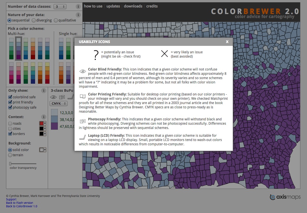
In tools like Color Brewer, you can set palette generation to preference color-blind or print-friendly colors.
Design Balance
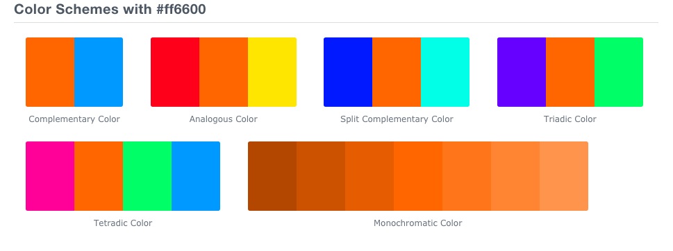
Complementary colors are colors that are accross eachother on the color wheel. You can test this by staring at a color for a long time and closing your eyes to see what color is the "residue" you view in your eyelids. Strategies in "good design" vary. You can for example try for a monochromatic design:

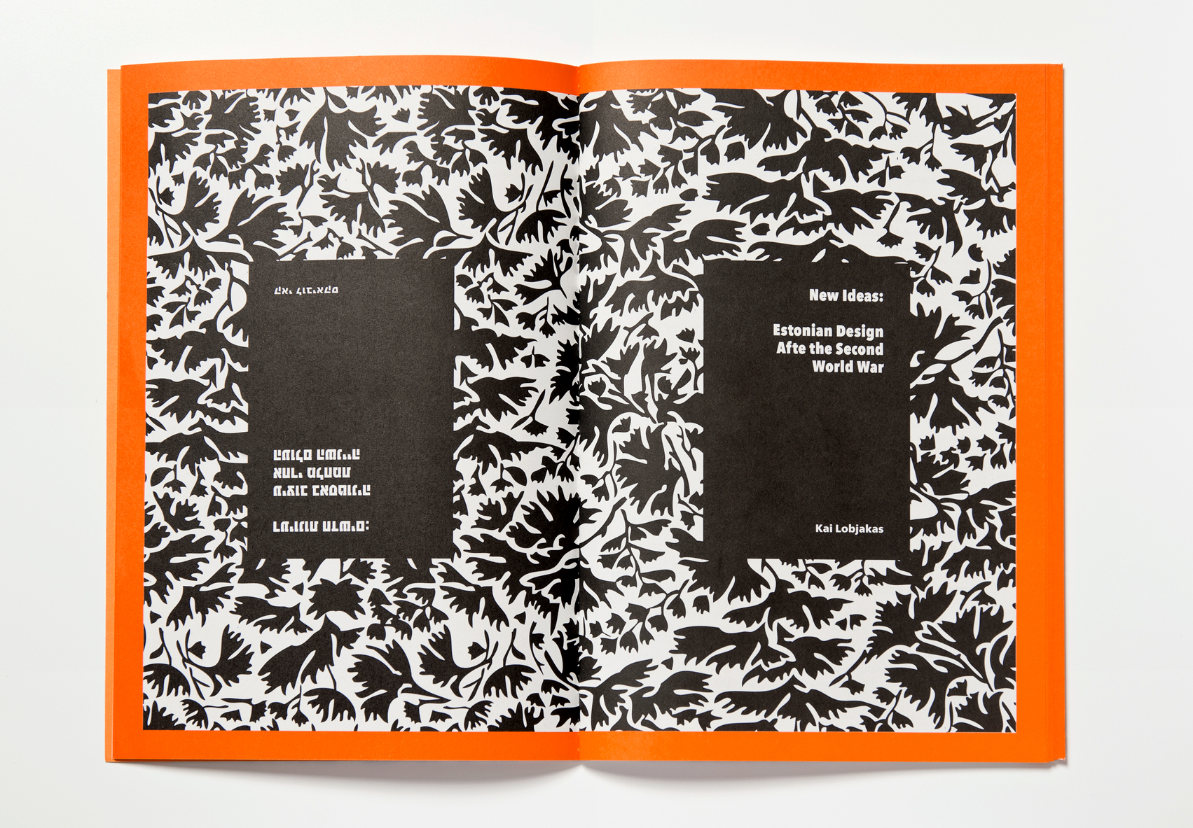
Or you can choose one color and two subdued colors like black/white to highlight something of pertinence.
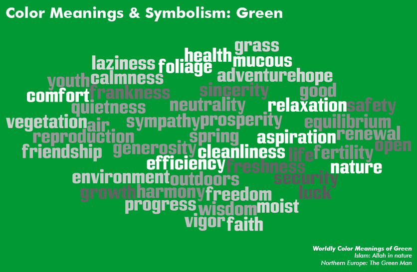
Keep in mind that colors for visualizations have meaning, and if you are building comparisons, you can do damage in using only the same colors. The colors in the below graph are too similar, for example, and it does not serve the visualization to collapse difference between candidates.

To note as well: a computer references colors differently than is perhaps reflexive to humans; colors for the web will likely appear in the following formats:
- RGB | rgb(255,102,0) - proportions of red, green, blue
- Hex | #ff6600
- HSL | hsl(24,100%,50%) - hue, saturation, lightness
-
Check out some design tools
The following might help you understand design and color, generate palettes or get advice for your projects' development.
- Design and Redesign in Data Visualization
- Perception Concerns
- Gestalt Theory
- Forecast.io API: well-structured API for global weather information
- Sequential Color Theme Map for Choropleths
- Picking Color Palettes: A Guide
- "Printing Code": plus Rune.js - a project developed out of the ITP program - is another awesome course you should check out
-
Cheat to complete
The title here is a bit of a joke, but sometimes the clock works against you when it comes to design at a hackathon or under tight project delivery limitations, and so resources that can help mediate design investment are welcome.
Here are some tools to help:
- Moodboard Generator: an online tool for creating moodboards
- Document CSS
- Living StyleGuide (SASS/Markdown)
- Poor man's style guide
- Source.JS, node styleguide generator
- Styleguide.io Resources
Glossary
Moodboard
An arrangement of images, materials, pieces of text, etc., intended to evoke or project a particular style or concept.
Web Accessibility
Web Accessibility refers to the inclusive practice of removing barriers that prevent interaction with, or access to websites, by people with disabilities. When sites are correctly designed, developed and edited, all users have equal access to information and functionality.
Design Thinking
A methodology used by designers to solve complex problems, and find desirable solutions for clients. Design Thinking draws upon logic, imagination, intuition, and systemic reasoning, to explore possibilities of what could be, and to create desired outcomes that benefit the end user .
Resources & Materials
You may find it useful to review this handout during the design/sketch phase of your project.
The following resources are useful for more information on design and color choice, with a few awesome tools.
- Color Brewer: tool for generating palettes.
- Geocolor: tool for generating agreeable map palettes.
- Color Hexa: best tool for generating palettes, suites of complementary colors and understanding how type will look on those colors for the web.
- FlatUI Colors: simple site cataloguing the flat ui palette for the web.